

Key Takeaways:
- The best multicoloured rugs for a playful room usually have one clear visual idea, not simply the greatest number of colours.
- Character shapes, graphic patterns, floral clusters and flowing stripes create different kinds of playfulness.
- Repeated colours and a recognisable structure keep a lively rug from looking visually confused.
- Darker palettes and detailed motifs can feel playful while still suiting an adult bedroom or shared living area.
- A small rug with strong contrast or a recognisable silhouette can carry more visual weight than its measurements suggest.
- The right choice depends on how the space is used, what already surrounds it and how prominent the rug should become.
Some rooms have all the necessary furniture yet still look overly sensible. The sofa works, the bedroom is comfortable and the reading chair has its lamp, but nothing interrupts the beige surfaces or straight outlines. One expressive rug can loosen that arrangement more effectively than several extra accessories.
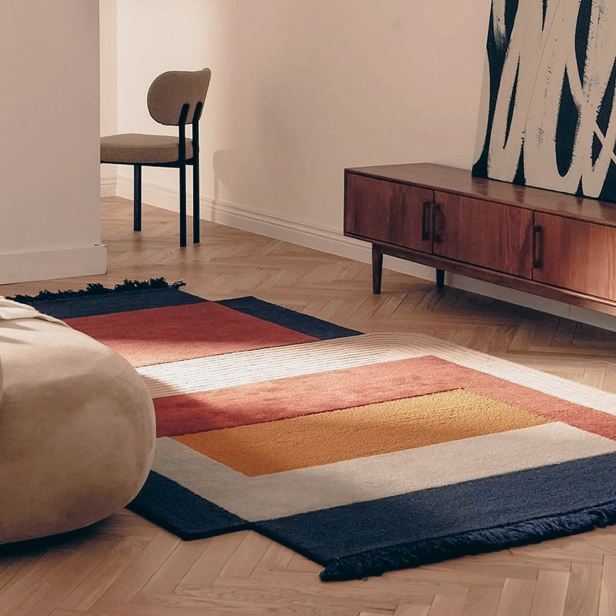
Adding several colours will not automatically do the job. Scattered shades can compete with one another, whereas the same palette becomes much easier to read when it belongs to a face, a flower cluster, a check or a set of flowing stripes. The eye finds the idea first and the individual colours afterwards.
Scale and placement then decide how much attention that idea receives. A compact character may enliven one corner; a longer pattern can carry colour through a narrow stretch of floor.
What Makes a Multicoloured Rug Feel Playful, Not Just Colourful?
A winged cat, a row of checks and a cluster of flowers may contain a similar number of colours, yet they do not ask the eye to process them in the same way. On the cat, each shade describes part of the figure. Checks establish a repeated rhythm. In a floral composition, the colours gather around recognisable leaves and petals. The palette stays readable because it has something visible to organise it.
Black outlines and stronger contrasts remain distinct even in subdued daylight. Neighbouring greens, blues and pastels blend more readily, especially in a north-facing UK room or a space mainly seen in the evening. A soft palette may look more muted at home than it does in a brightly lit product image, so the light the rug will usually receive deserves as much attention as the number of colours.
There is little benefit in matching every shade elsewhere. Repeating one green, pink or blue in a cushion, print or small object is usually enough to connect the rug with its surroundings. Copying the entire palette can make the setting look more arranged and leave the rug with less individuality.
Choose the Kind of Playfulness Before Choosing a Multicoloured Rug
Otto Orange Dog and Blue Cat Cuddling Whimsical Tufted Rug is understood almost immediately as two animals sharing a pose. Orange, blue and black help describe the figures, but the colours are not left to create the character on their own. Beside a bed or chair, the complete silhouette gives a small patch of floor a clear focus.
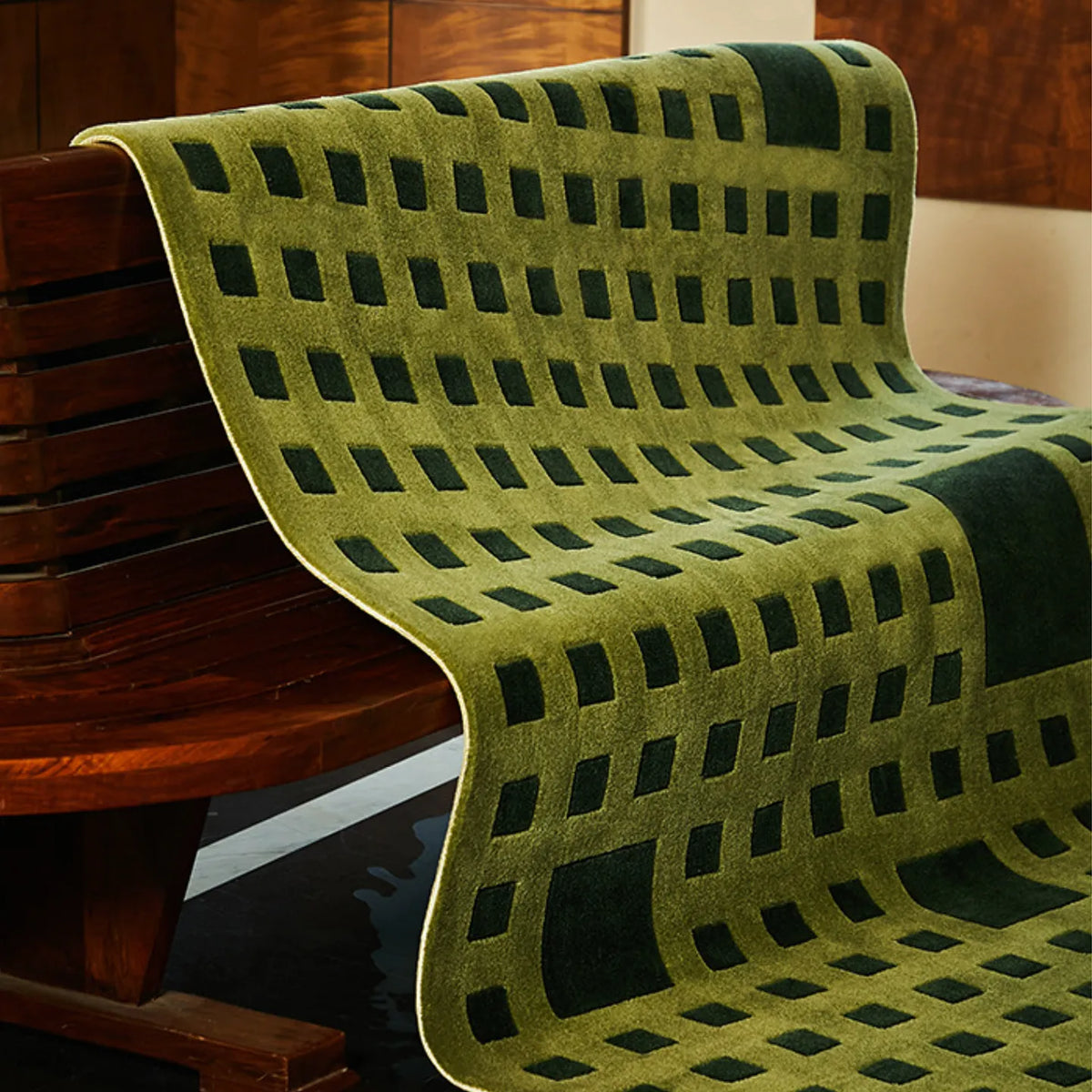
Rafi Green & Lime Wavy Striped Tufted Runner Rug creates a different energy. Its greens move along repeated wavy stripes, drawing the eye through the length of the rug. There is no face or figure to interpret. Repeated stripes carry the colour along the rug, which works naturally beside a bed or through a narrow route.
Celia Colourful Whimsical Floral Garden Irregular Tufted Runner Rug sits between those two approaches. Recognisable floral details create a garden reference, while the irregular composition keeps the design from settling into a conventional floral repeat. It offers more decorative detail than Rafi and less of the single-character focus found in Otto.
Choosing between them starts with a simple question: should the rug introduce a memorable character, carry movement across the floor or bring in a more layered decorative scene? What Makes a Rug Whimsical? Choosing Shape, Colour and Character for Your Room looks more closely at how those features alter the mood of a rug.
Why Repetition Makes Several Colours Easier to Read
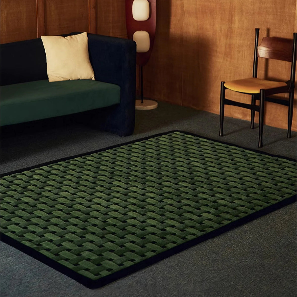
Across Noor Blush Pink Black Ivory Checkered High Low Tufted Rug, the same squares return often enough for the eye to anticipate the next one. Blush, black and ivory remain lively together, but the repeated grid prevents any single shade from wandering away from the design.
That steady rhythm becomes useful near books, artwork and everyday objects, where the surrounding area already contains plenty of small detail. Noor does not have to become pale or plain to sit among them. Its structure keeps the colour legible from across the room as well as close up.
This balance is particularly useful around furniture, books, artwork or everyday objects that already contribute their own detail. A rug does not have to become quieter, but its internal logic should remain clear from the doorway as well as close up.
If the main concern is preventing several colours from overwhelming the rest of the interior, How to Add Colour with Multicoloured Rugs Without Making a Room Feel Messy explores palette repetition, visual boundaries and the value of leaving quieter areas nearby.
Can a Playful Multicoloured Rug Still Look Grown-Up?
Put Faye Black & Red Gothic Winged Cat Shaped Tufted Rug beside pale toy storage and several novelty accessories, and the cat becomes part of a themed setting. Beside dark wood, plain bedding or a simple leather chair, the same winged figure looks more eccentric than childlike.
Its black and red palette helps. The darker contrast gives the cat more graphic weight than a candy-coloured version would carry, so the motif can remain humorous without making the entire bedroom or living area look sweet. Black and red give the cat more graphic weight than a pale or candy-coloured version would carry. Beside dark wood, plain bedding, a leather chair or simple painted furniture, it can look eccentric and personal without turning the whole setting into a themed interior.
Adult spaces often benefit from that small note of humour. In a room of plain furniture and neutral finishes, one unusual rug can introduce humour without asking the rest of the scheme to follow it. The key is to let the character remain specific. Repeating cats, wings or gothic motifs across cushions, prints and accessories would make the reference much more literal.
A colourful rug can also feel grown-up through restraint elsewhere. Plain walls, visible floor and furniture with clean outlines give an expressive motif enough visual space to stand on its own.
Why a Small Multicoloured Rug Can Carry More Visual Weight Than Its Size Suggests
Benny Pink Goofy Fried Egg Face Shaped Tufted Rug measures only 69 × 75cm, yet the face appears before its dimensions have much chance to register. The fried-egg outline, pink centre and brighter details make it more noticeable than a plain rectangle covering a similar amount of floor.
That difference matters beside a chair, dressing table or the open side of a bed. Benny does not have to reach several pieces of furniture to justify its position; the recognisable silhouette gives the eye a reason to stop there. Its face and fried-egg outline are recognised quickly, though, so the rug attracts attention more readily than a plain rectangle covering the same area. The contrast between the pink face, pale egg shape and brighter details strengthens that first impression.
This is useful where the available floor is limited. A small rug does not have to imitate an area rug or reach several pieces of furniture to justify its position. Beside a chair, near a dressing table or at the open side of a bed, a clear silhouette can give a previously unclaimed patch of floor its own identity.
Strong contrast increases that presence, as do black outlines and familiar subjects. Softer colours, blended patterns and low-contrast organic forms tend to sit more quietly. Measurements tell you whether a rug fits; they do not tell you how dominant it will appear once placed.
How to Choose a Multicoloured Rug for the Way the Room Is Used
The available floor usually narrows the choice more quickly than the palette does. A long strip beside a bed gives colour room to travel in one direction. A small opening beside a chair needs a design that still makes sense within a compact footprint. In a furnished living area, much of an intricate outline may disappear once the rug meets the sofa or table.
Notice which part will remain visible from the doorway and from the seat used most often. A recognisable figure benefits from an exposed outline, whereas a repeated surface pattern can tolerate a little more overlap. High contrast and darker borders draw attention quickly; tonal colours and softer edges settle more quietly into the floor.
The strongest rug is not necessarily the largest or the one carrying the most colours. It is the one whose main idea remains clear in the space available.
The best choice is not necessarily the rug with the most colours. Look for a design whose colours form something readable, then choose the size and position according to how noticeable you want it to be. Browse the Multicoloured Rugs Collection to compare character shapes, checks, floral compositions, flowing stripes and graphic motifs for the part of the floor you want to bring to life.


0 comments