

Key Takeaways:
- Graphic rugs bring shape, symbol and visual character onto the floor, not just pattern.
- The right choice depends on role: some graphic rugs anchor a zone, while others work better as smaller accents.
- Word rugs, emblem styles, playful shaped pieces and more abstract graphic florals do not create the same mood.
- Larger rectangular styles suit living rooms and clearer floor zones better, while smaller graphic rugs work well beside a bed, near a chair or in a creative corner.
- A graphic rug usually works best when the rest of the room gives it enough breathing room.
Some rugs are there to calm a room down. Graphic rugs do something a bit different. They bring a stronger visual idea onto the floor. That might come through a word, a symbol, an irregular or shaped outline, a bold patch of colour, or a rug that feels more like a visual object than a background piece. In UK homes, where rooms are often compact and furniture tends to do a lot of practical work, that kind of rug can change the mood quickly.
That does not mean every graphic rug has to be loud. Some are bold and direct. Some are playful. Some act like small visual interruptions that stop a room looking too safe or too predictable. The question is not whether graphic rugs are too much, but which direction in the Graphic Rugs collection suits the room you actually want to live in.


What Gives a Graphic Rug Its Distinctive Look
A graphic rug usually feels clearer and more intentional than a standard patterned rug. You notice the shape, symbol or attitude first. It is not just there to add pattern. It is doing something more specific through shape, contrast, outline or symbol.
That is why a piece like Damn Shaggy Rainbow Graphic Word Art Rug feels graphic straight away. The colour, text and outlined lettering are doing the work together. It does not rely on repeated pattern or texture alone. It lands more like a statement on the floor, which is exactly why that kind of rug suits homes that want a bit more attitude and humour.


The same is true of Pu Yellow Small Shaggy Graphic Emblem Rug, even though it is much simpler. At 45 × 50 cm, it works best as a small graphic accent rug rather than a full floor piece, which is part of why the design reads so clearly. The badge-like shape, strong border and centred symbol give it a clean, recognisable visual identity, whether it is placed beside a chair, near a reading corner or used to sharpen a smaller patch of floor. It is a good example of how graphic rugs often work. A rug does not need a complicated pattern to feel graphic if the visual idea is clear enough. A white version is also available for spaces that want the same emblem-like shape in a quieter colour direction.


What makes this category different is that these rugs often feel closer to illustration, signage, collage or cut-out shape than to a standard repeating print. That is usually the part worth paying attention to when choosing one. You are not only choosing a colour or a motif. You are choosing how much visual presence you want the floor to have.
From Word Rugs to Emblems and Playful Shaped Designs
One reason graphic rugs can feel harder to shop than other styles is that they do not all arrive in the same way. In your collection, the category works best when it is understood as a group of related graphic expressions rather than one single look.
Cheeky Fart Puff Red White Leopard Shaped Tufted Rug shows how a graphic rug can feel playful without losing its point of view. It is graphic not because of a conventional all-over pattern, but because the silhouette is so clear and memorable. In a reading corner or beside a chair, it brings exactly the kind of odd, characterful shape that makes the space feel more personal rather than more decorated. This is the kind of rug that works best as a smaller accent, where its humour and outline can land properly without having to anchor the whole room. It brings just enough weirdness to make a cosy corner feel more alive, especially when the rest of the space stays fairly simple.


For more on why this kind of shape works better in real rooms than people often expect, Animal Shaped Rugs in UK Homes That Look Surprisingly Good is the clearest next read.
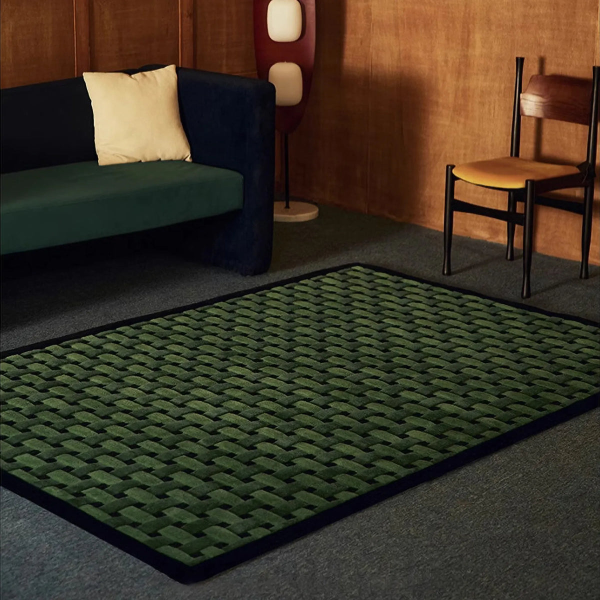
Then there is the more abstract side, where the rug feels graphic because of composition, colour blocking and a more cut-out, arranged look. Freya Multicolour Moss Green Abstract Floral Rug is a good example. It is not a quiet floral. The shapes are more graphic than delicate, and the colours feel arranged rather than scattered. That makes it a good fit for someone who likes the idea of graphic rugs but does not want a slogan or emblem.


That is the easiest way to make sense of the collection. Some graphic rugs are built around words or phrases. Others feel more like emblems or icons. Some lean into playful or irregular shaped design, while others sit in a more abstract or graphic-floral direction. They all belong to the same family because they bring a stronger image to the room, but they do not all create the same mood. If that more playful, silhouette-led side is what you are drawn to, Animal Print & Shaped Rugs is the nearest collection to explore next.
Graphic Rugs for Bedrooms, Living Rooms and Creative Corners
The right graphic rug depends a lot on where it is going, and this matters even more with your collection because not all of these pieces play the same role. Some are large enough to help define a clearer zone. Others work much better as a smaller accent that gives one part of the room more personality.
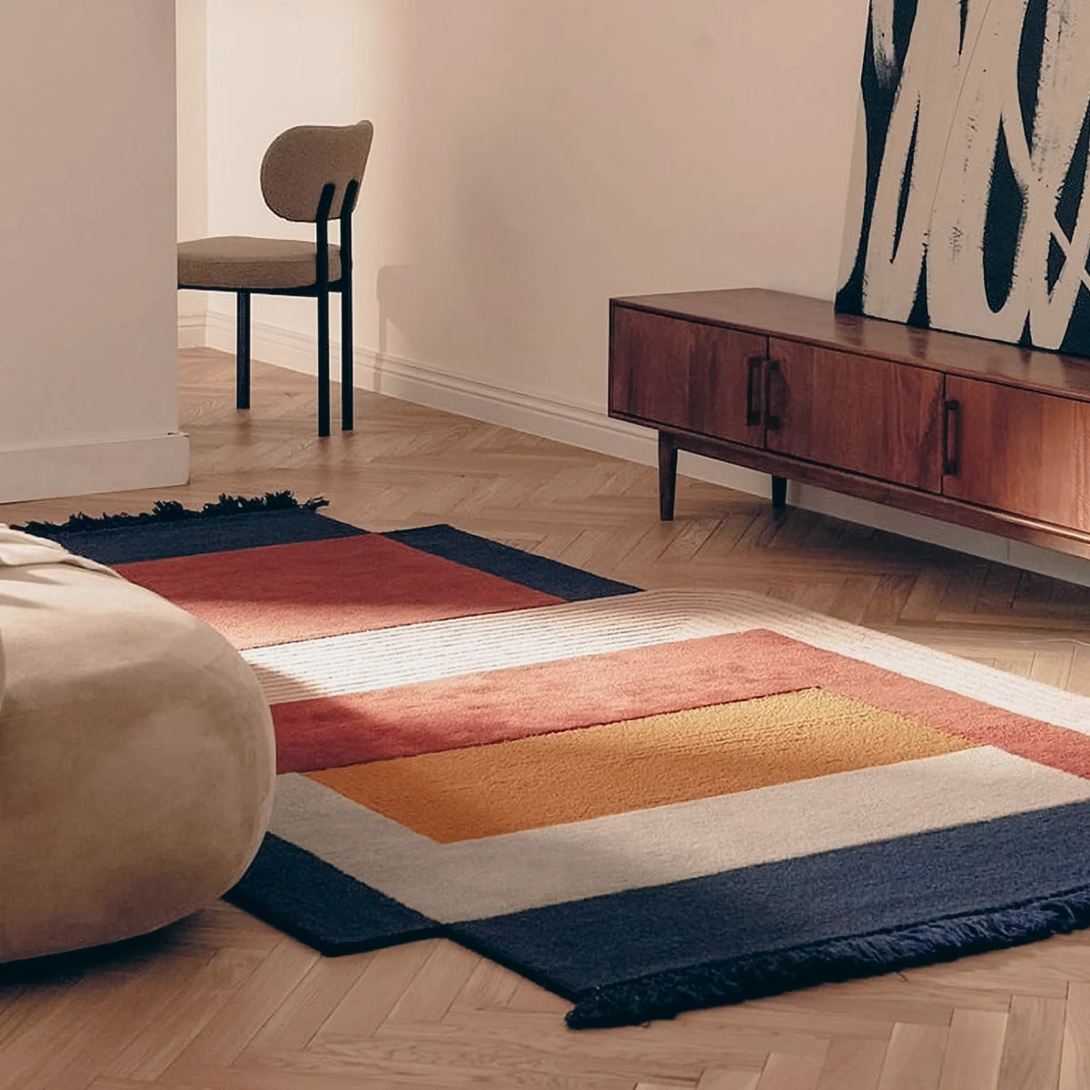
If the rug needs to help shape a living room or a clearer visual zone, a rectangular style with enough surface presence makes more sense. Poolside Blue White Grid Modern Graphic Rug is a strong example of that kind of piece. In 120 × 160 cm and 140 × 200 cm, it has enough presence to help define a seating area or give a living room a clearer edge, while the 80 × 120 cm size works better in a smaller corner or a tighter patch of floor. Even with its framed graphic layout, it reads as a room-shaping rug rather than just a novelty accent, which is what makes it useful in spaces that need more visual structure from the floor up.


That is quite different from a smaller graphic piece like Please Have a Seat Shaggy Graphic Word Rug. At 72 × 92 cm, it works better in bedrooms, beside a bed, at the edge of a reading chair or in a creative corner where you want a little visual spark rather than a full-room base. It gives character quickly, but it does not need to carry the whole room. The same is true of And Have Fun Shaggy Graphic Word Art Rug, which comes in a slimmer 46 × 100 cm format that suits narrower patches of floor especially well. Together, they show how smaller graphic rugs can work more like expressive accents than full zone anchors.


If you are especially drawn to the word-based side of this category, Why Graphic Word Rugs Are So Popular in Bedrooms & Creative Spaces goes further into why these smaller statement pieces work so well in bedrooms and more expressive corners.
This is often the point where the choice gets harder. It is easy to see a graphic rug you love without stopping to ask whether it is meant to define a zone or just punctuate one. For a living room, especially in a UK flat where the floor has to help organise the space, larger rectangular graphic rugs usually do more useful work. Smaller word rugs, shaped rugs and emblem-style pieces are often better when the goal is to make one corner feel more alive.
Choosing Between Bolder Statement Pieces and Softer Playful Graphics
This is usually where the split starts to matter. Once you know you like graphic rugs, the next question is not simply which one looks best on its own. It is whether you want the rug to act like a statement piece or a softer graphic accent.
Some people want the rug to arrive with a bit of force. They want it to bring personality immediately and stop the room feeling generic. In that case, stronger word rugs, emblem styles and more direct shapes usually make sense. These are the kinds of pieces that feel expressive even before you build the rest of the room around them.
Other people want the room to feel more individual, but not more intense. They still want shape, charm and a recognisable silhouette, just in a softer key. That is where the Maisie floral shaped rugs work well. Available in Green, Beige & Blush Pink, Blue & Pale Blue and Cream & Pale Blue, they still read as graphic because the flower shape is so clear, but they feel gentler than a slogan rug or a more forceful emblem. In 80 × 80 cm, they work especially well beside a bed, near a chair or in a smaller corner that needs a softer accent. In 100 × 100 cm, they have enough presence to act as a clearer focal patch of floor while still keeping that playful, approachable feel. They bring personality without feeling pushy, which is exactly why they suit bedrooms and softer corners so well.


That softer side of graphic rugs matters more in bedrooms and smaller spaces. Not every room wants a rug that feels like a joke, a sign or a poster on the floor. Sometimes a shaped floral piece does the job better because it still gives the room a point of view without making the whole space revolve around it.
So the real divide is not between grown-up and childish. It is between graphic rugs that want to lead the room and graphic rugs that want to soften it while still making it feel less ordinary.
How to Make a Graphic Rug Feel Intentional in the Room
Give the rug a clear role
It might be there to wake up a quiet corner, sharpen one patch of floor, or break up a room that feels a little too safe or too assembled from standard pieces. What makes a graphic rug feel wrong is usually not the rug itself. It is the sense that it was added without deciding what it was meant to do.
Do not ask a small rug to do a large rug's job
A smaller piece is usually better when it is treated as an accent rather than an anchor. Beside a chair, by the bed, in a reading nook or in another compact spot, it can bring just enough visual energy to make that part of the room feel more alive. A larger rectangular graphic rug can do more structural work. It is better at defining a zone, giving furniture a clearer edge and helping the room feel more organised from the floor up. A lot of rugs that seem too quirky or too slight are really just being asked to do the wrong job.
Let the rug have some breathing room
That does not mean everything around it has to be plain, but it does help if the rug is not competing with several other strong motifs at once. Patterned cushions, busy throws and too many decorative surfaces can make a graphic rug feel less intentional, even when the rug itself is good. It usually lands better when there is a bit of visual breathing room around it.
Mood matters as much as colour
Some feel cheeky, some feel cleaner and more modern, and some feel softer and more playful. Colour matters, but it is not the whole story. A rug can still feel right in the room even when it is not picking up every colour perfectly, as long as the overall tone makes sense with the furniture, lighting and shape language around it.
Softer graphics still need restraint
Because they are gentler than louder statement pieces, people sometimes assume they can be surrounded by lots of other cute or decorative details. In reality, they often look better when the background is a little clearer. Too many sweet shapes, soft motifs or small decorative gestures nearby can make the room feel overworked. A calmer setting usually helps these rugs feel more charming, not less.
The point is not to force a graphic rug to behave like a neutral. It is to give it the kind of role that suits its size, mood and visual force. Once that role is clear, a graphic rug stops feeling like an extra idea added at the end and starts to feel like part of the room's structure. The full Graphic Rugs collection is the best place to keep exploring from there.


0 comments