
Key takeaways
- Checkered rugs make rooms feel tidier because they add a clear visual boundary, not because they hide mess.
- The pattern only feels loud when the scale is wrong, so choose bigger checks for statement and tighter grids for calmer rooms.
- Low-contrast checks and warmer tones feel easier to live with than sharp black and white in smaller spaces.
- Texture matters in UK light, and woven or high-low grids look richer than flat printed checks.
- Runner-style checks work especially well in hallways because the rhythm makes narrow spaces feel intentional.
- When you want the safest route, start with a calmer check or move to neutrals for the same structured, sorted feeling.
Checkered rugs keep coming back because they do something a lot of UK homes need. They stop a room from feeling a bit floaty. In narrow hallways and busy living rooms, a plain floor can make everything look slightly scattered, even when it is tidy. In practice, most UK rooms land well with one of three routes: a tighter grid for calm order, a warmer low-contrast check for everyday softness, or a bolder square check when the rug needs to be the main feature, so the room feels calmer and more pulled together.
A check does not need to be loud to help. It gives the floor shape, so a seating area feels anchored and a walkway feels more like a path. People call them chequered, checkered or simply checked, but the real choice is the style you want to live with day to day, bold squares, softer checks, or a quieter grid that reads more like texture.
Browse our Checkered Rugs collection, then come back when you are ready to narrow it down.


Why checkered rugs make rooms feel tidier without adding clutter
A room can feel messy for reasons that have nothing to do with actual mess. In smaller UK spaces, the eye often has nowhere to rest. Furniture can feel like it is floating slightly off centre, corners can feel unfinished, and the floor can read as one large blank plane. A checkered rug fixes that by giving the room a visible structure, so objects and furniture feel like they belong inside a frame rather than scattered on top of empty space.
That is why something like Noor Brown Black Ivory Checkered Irregular High Low Wool Rug works so well as a baseline. The contrast is clear enough to create a boundary, but the pattern is not shouting for attention. It anchors a seating area and makes the room feel more deliberate, even before you change anything else.
For the deeper explanation of why this works so reliably in winter light and in smaller UK rooms, Why Geometric and Checkered Rugs Make UK Homes Feel Warmer (and Less Messy) in Winter goes into the same idea in more detail.


The pattern only feels loud when the scale is wrong
Most people do not regret choosing a checkered rug. They regret choosing the wrong kind of check for the size of the room. Scale is the difference between a rug that feels graphic and intentional and one that feels a bit too busy for daily life.
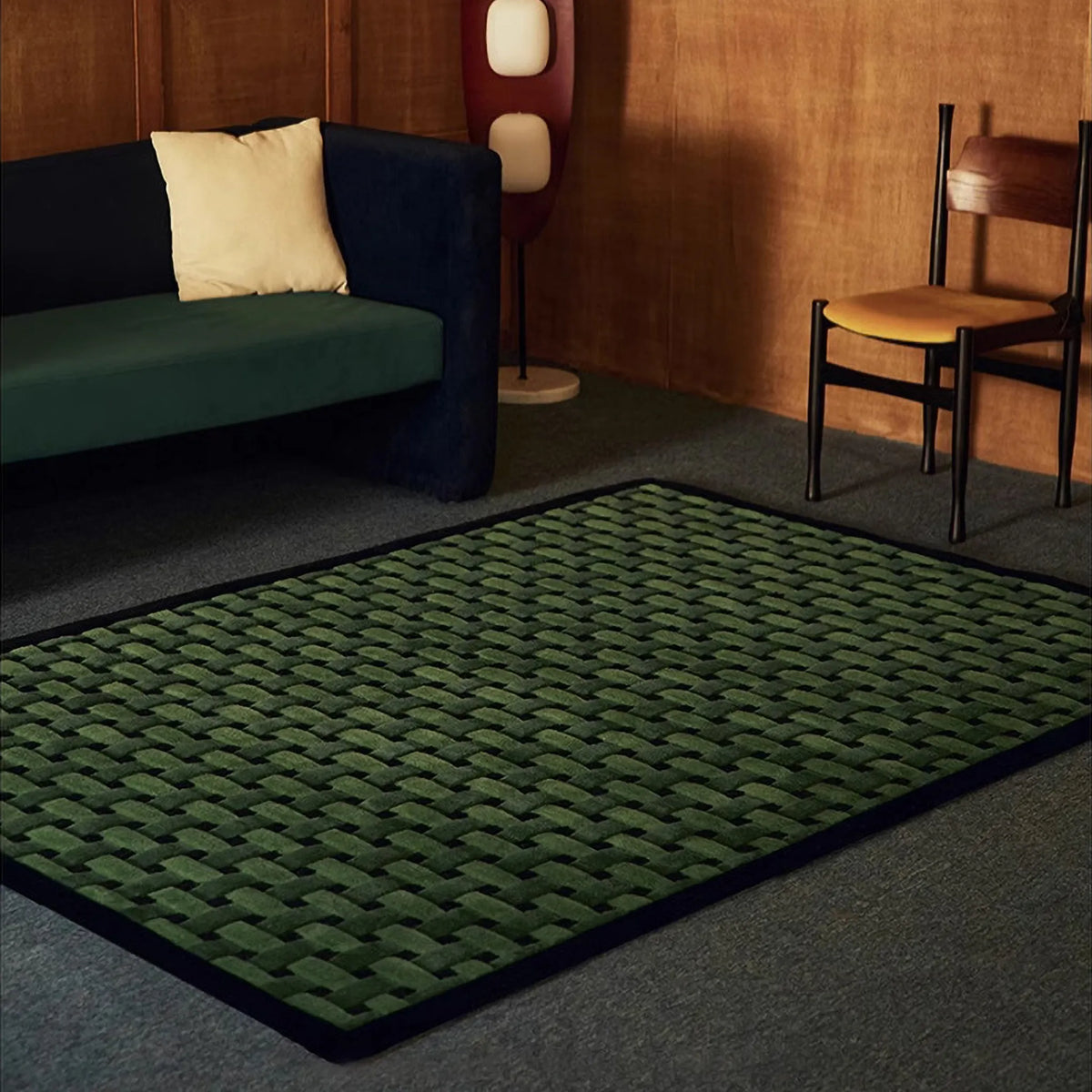
Bigger squares have more personality. They read bolder, and they create a clearer rhythm across the floor. That can be brilliant in a room that feels plain or under-styled, but it can feel like too much when the space is already visually full. Noor Green Black Mint Checkered Irregular High Low Wool Rug is a good example of that bolder direction. It is a statement check, and it suits rooms where you want the rug to do more of the talking, especially against calmer furniture.


Smaller grids do something different. They often read quieter because the pattern becomes more like texture from a distance. That is why fine grid rugs tend to be easier in compact flats, in bedrooms, and in rooms that already have artwork, bookshelves, or patterned upholstery. Salina Navy Blue Grid Pattern Modern Rug sits in that steadier lane. It still adds structure, but it does it in a way that feels more blended, which is why it is often the safer choice when you want order without a dramatic style shift.


A simple way to choose between the two is to think about what you want the rug to do first. When the room already has a lot going on, keep the check smaller or lower-contrast, and let texture do the richness instead of colour.
When you want calm, go low contrast and let the structure do the work
This is where checkered rugs become more flexible than people expect. You do not have to choose between a bold black and white checkerboard and a completely plain rug. There is a big middle ground where the rug still has structure, but it feels easier to live with day to day.
Jules Black White Modern Grid Pattern Rug is the cleaner, more architectural version of this idea. It brings order through a crisp grid, and it suits homes that already lean modern, with simpler furniture shapes, clean lines, and a slightly sharper palette. In rooms with white walls, darker wood, black details, or a more minimal look, Jules can make the space feel more pulled together without adding extra colour decisions.
Amber Brown and Cream Checkered Textured Modern Rug does the same job with a softer tone. The warmth in the colour makes it feel more lived in, and it suits homes that lean natural and comfortable rather than graphic. In rooms with oak furniture, warmer lighting, linen textures, or a generally softer palette, Amber is often the easier choice. It still gives you that structured boundary underfoot, but the overall feel is more gentle.


When you are in the mood for the safest, lowest-risk version of this whole story, that is where neutrals come in. A lot of rooms do not need more pattern, they need a calmer base that still has definition. Our Neutral Rugs collection is built for exactly that, and No Sun, Still Want Your Flat to Look Sorted? Try Neutral Rugs breaks down how to choose between lift, depth and order without overthinking it.
In UK light, texture is what stops a grid from feeling flat
Two rugs can look similar online and behave completely differently in a real room, especially in the months when daylight is weak and lighting is mixed. Flat printed grids can look a bit lifeless in low light. Textured grids, on the other hand, catch shadow and soften the floor, so they feel warmer and more substantial even when the palette is restrained. High-low texture also reads more premium because it breaks up the light and adds real depth, instead of sitting on the surface like a flat print.
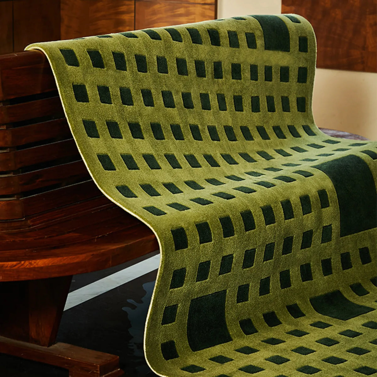
That is why woven and high low checkered styles work so well in UK homes. Bambusa Green Woven Grid High Low Tufted Wool Rug has that woven structure that gives the grid depth, so it looks richer and more finished without needing high contrast. Tessera Moss Green Grid Modern High Low Rug does something similar with a more graphic grid, where the high low surface creates the sense of rhythm even when the colour stays calm.
These are the rugs that tend to make a room feel more expensive without changing anything else. Not because the pattern is louder, but because the surface is doing more work.


Where checkered rugs look best in real UK homes
A lot of people imagine a checkered rug as the centrepiece of a living room. In practice, it is often more effective when it is doing a practical job, especially in smaller homes. A checkered rug can be an anchor under a coffee table, but it can also be a boundary beside the bed, a direction through a narrow walkway, or a way to make an awkward corner feel intentional.
Runner shapes are where checkered patterns can be especially satisfying. A long, narrow space benefits from rhythm. It makes a hallway feel like a path rather than just a passage. Arlo Black and White Asymmetric Checkered Tufted Runner Rug is a strong example of a check that works with movement. The grid is broken up just enough to feel designed rather than strict, and it brings order to the kind of narrow spaces UK homes tend to have.
For entrances and hallways, Tidy Home, Bleak Hallway? Rugs That Make UK Entrances Feel Finished goes deeper on runner vs entry rug logic and what actually holds up in that part of the home.


How to use modern checkered variants and still keep the room calm
Not every checkered rug looks like a classic chessboard, and that is not a problem. Some of the most useful checkered rugs are the ones that are slightly understated, because they still give you structure without pushing the room into a strong style statement.
A tonal grid is one of the easiest ways to do that. Pure Black Minimalist Modern High Low Hand Tufted Rug is a good example. The check is there, but it is created through texture rather than colour contrast. It works well in rooms where you want depth and structure, but you do not want a visible pattern to be the first thing you notice. It is also the kind of rug that looks different across the day, because the grid becomes more visible as the light shifts.
Diamond patterns sit close to checks too, especially when they are made through high low surface rather than sharp print. They behave like a structured pattern, and they can give you the same anchored feeling as a check, just with a slightly more tailored look. When you love the idea of checkered rugs but want the least graphic version of the trend, this is often the route that feels most grown up.


A simple way to choose without overthinking it
Decide what you need the rug to do first. A statement room suits bolder checks that can be seen from across the space, while calmer rooms usually look better with lower contrast, tighter grids, or texture that makes the pattern feel built into the surface rather than stamped on top.
Once that choice is made, placement becomes easier. A checkered rug works when it finishes a real zone, under a coffee table, beside the bed, or through a walkway you use every day. It does not need to cover every inch to make the room feel more settled. It just needs to land in the spot where the room currently feels a bit unfinished.
When you are ready to compare styles and colours side by side, head back to our Checkered Rugs collection and use the pattern scale and contrast logic above to narrow it down fast.


0 comments