
Key Takeaways:
- Grey light flattens contrast, so tidy UK flats can still look tired.
- Neutral rugs work best when the goal is "sorted", not styled.
- Use Aim, Spot, Surface to choose faster and avoid overthinking.
- Clean-base neutrals with a warm edge tend to work better in low light.
- Texture and low-contrast pattern add depth and order without making a room feel busier.
- Small placements often give the fastest payoff in compact UK homes.
By late winter, a lot of UK flats hit the same point. You tidy up, the surfaces are clear, the laundry is done, and yet the room still looks tired. It is not that your home is a mess. Grey light just takes away contrast, so floors, walls and furniture start blending into one long, flat layer.
That is where neutral rugs quietly win. They do not really "decorate" the room so much as give it back structure, so the space looks cleaner, calmer, and oddly more cared for without feeling styled. Our Neutral Rugs collection is built for exactly that moment, not the moment you want a statement, but the moment you want the flat to look sorted again.
We've seen these small changes work best in real UK flats and rentals, especially the kind with pale flooring, white walls and not quite perfect light. Neutral looks simple on paper, but in grey weather the right one can do more than people expect.
Before you scroll, one simple filter makes this much easier: Aim, Spot, Surface. Start with the job you need the rug to do (lift, add depth, or create order), then the place it needs to work (bedside, entry, or sofa side), then the surface that helps it do that job best. A cleaner base usually lifts, texture adds depth, and low contrast pattern helps create order. That order matters. Once you pick the spot first, you stop choosing "a colour" in isolation and start choosing what the room actually needs.


Brighter neutrals lift a room when everything looks grey
Grey weather makes the floor look darker than it really is. In a small flat, that one detail can drag the whole room down, especially with pale walls and low winter light. Brighter neutrals help quickly because they sit right under your sightline. Off white, cream, stone and soft oat tones reflect what daylight you do get, and they do it without the harshness that pure white can bring in UK homes.
In low light, the neutrals that tend to work best usually have two things going for them: a clean base and a warm edge. In practice, that means they do not read green-grey or yellow-beige straight away, and they still feel soft beside white walls and pale wood instead of turning stark. North facing rooms tend to exaggerate the problem, and warm evening lighting can push some beiges yellow while making others look oddly grey.
For lift, cleaner and lighter usually works better than people expect. The neutral to avoid in winter is the one that turns muddy. A beige that looks slightly grey or slightly yellow on screen often reads duller in real daylight, and it can make the whole room feel tired. At the other extreme, a very bright white can feel flat and a little harsh against grey skies and cool flooring. Another common miss in small flats is the too plain, too flat option. A very smooth cream with no texture can make a room feel emptier in grey light, not calmer, because it removes the last bit of depth your eyes are trying to find. Clean cream, soft oat and warm off white tend to stay fresher, and a little structure in the surface keeps the room from feeling bare.
Bedside and entry spots are where this usually shows up first. A rug there changes the part of the room you read first, so the whole space can feel less tired without a bigger reset. For that kind of lift, Nori Cream Curvy-Line High-Low Textured Rug (60×90 cm, 80×120 cm) and Signe Grey & Natural Fringed Round Handwoven Rug (100×100 cm, 120×120cm) fit the brief well. Small Rugs for UK Flats: How to Make Compact Spaces Feel Intentional is useful if you want help deciding whether bedside or entry will give you the bigger change.


When the room feels flat, texture brings back depth
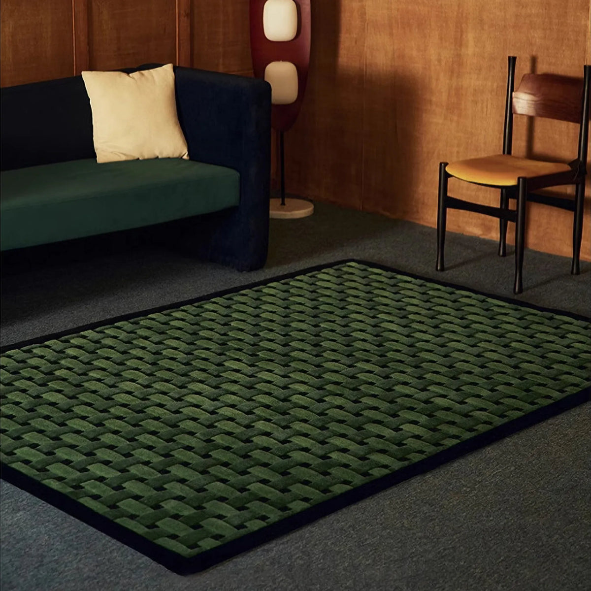
There is a specific kind of tired that happens in grey light. The room is not dark exactly, but it loses depth, and everything starts to look a bit two dimensional, especially once the afternoon hits. Texture brings that depth back without needing colour. High low pile, sculpted details and woven structure create shadow and movement, which is exactly what winter light removes. It is also one of the reasons a neutral room can suddenly look more expensive without changing anything else.
When a room looks flat, adding more décor usually does not solve the problem. What helps more is giving your eye one surface with shape, shadow, and a bit of movement. That is why texture does so much work in winter, but it is also where people can overdo it. Heavy shag in a pale neutral can sometimes look tired faster in long grey weeks, simply because it reads more fluffy than clean. When the goal is sorted, texture with structure tends to work better than softness alone.
This is usually the easiest place to start: one sculpted or structured neutral, in one spot you see every day. Nola Cream Beige Sculpted Circle High Low Tufted Rug (80×130 cm, 100×160 cm) works well when you want that effect in a visible zone. Ivo Cream & Mocha Grid High-Low Textured Rug (45×120 cm, 80×120 cm) tends to work better in narrower or smaller placements where you still want shadow and structure. If you want to compare finishes before choosing, Textured Rugs collection and Best Textured Rugs for Winter: High Low, Sculpted and Plush for UK Homes stay in the same lane.
Often, one finished patch of floor is enough to change the mood of the room, especially by the bed or just inside the door.


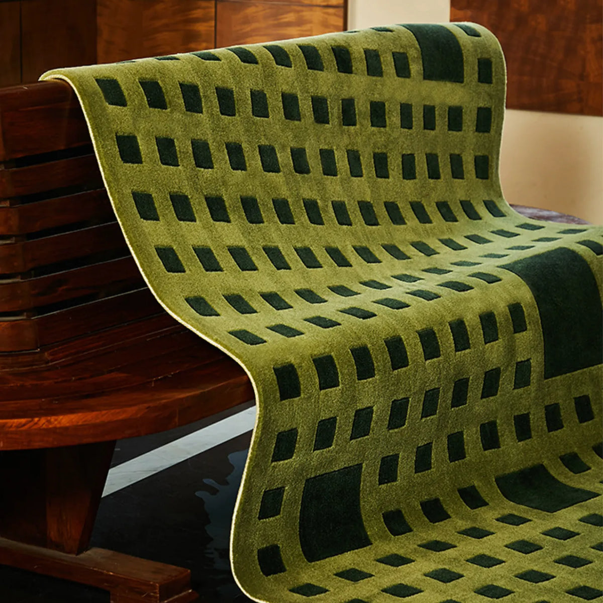
Calm pattern makes a flat look more organised, not more busy
A lot of people avoid pattern because they think it will make the room feel louder. In reality, low contrast pattern often does the opposite because it creates order. When a room looks messy in grey light, the issue is often not too much stuff but weak boundaries, and a border, stripe or grid gives your eye a frame so the space stops reading as one big blur.
This is especially useful when the room does not need more brightness, just clearer shape. The pattern mistake in grey light is usually not pattern itself, but contrast that is too sharp. Black and white geometry can look brilliant, but when you are already visually tired, it can feel harder at the end of a long day. Low contrast is usually the calmer route when the goal is sorted.
In practice, this is where a lot of "neutral" rooms start looking more finished. A soft stripe or grid can do the job without making the space feel busier. Elio Beige and Navy Striped High Low Textured Rug (up to 80×120 cm) is a good example, especially for entry, bedside, or sofa-side framing when you want a corner to feel more ordered rather than more decorated. Ivo (45×120 cm, 45×150 cm) does the same job in a grid rhythm, particularly in narrower areas. Why Geometric and Checkered Rugs Make UK Homes Feel Warmer (and Less Messy) in Winter follows the same logic of order and comfort rather than noise.


Softer edges stop neutral from feeling boxy
UK homes are full of straight lines. Skirting boards, door frames, sofas, cabinets. By February, adding another rectangle can make a room feel even more rigid, especially in smaller footprints. Soft edges help because a wavy outline or curved shape breaks up hard linework and makes the room feel less tight. It is still neutral, but it reads less boxed in.
This is also where the neutral equals boring idea starts to fall apart. In many small flats, the calmest change is not colour at all but outline. Changing the shape can soften the room faster than adding another decorative object, and it does it without making the space feel busier.
For narrow parts of the home that need to feel less strict, a softer edged runner usually works better than another standard rectangle. Alba Sand and Cream Wavy Edge High Low Tufted Runner Rug (74×180 cm) is a strong place to start. For a softer corner placement, Maisie Cream & Pale Blue Floral Shaped Tufted Rug (80×80 cm, 100×100 cm) shows the same idea in a different way, using shape to relax the room without pushing it into a loud colour story. Why Wavy Rugs Feel Right in UK Homes (Even When the Room Isn't Perfect) explains why shape is practical, not quirky.

Start with one dead zone, then stop
Most people do not need a full makeover in February. They usually need one corner to stop looking dead, and the best place is often the part of the flat they touch every day: the first step out of bed, the bit inside the front door where shoes always land, or the sofa side spot where feet actually go down. Fix that one zone properly, and the whole flat reads better. It starts looking cared for again, even if nothing else has changed.
Pick one corner, make it work, then leave the rest alone for a week. The space usually settles faster than people expect, and neutral works so well here because it does not ask you to commit to a new palette. For most UK flats, it solves the bulk of the winter problem on its own. A bedside corner might suit something softer and lighter such as Nori or Signe, while an entry or narrow strip often works better with Alba, Elio, or Ivo in slimmer sizes. You can stay in neutral and still feel done. If you want to compare shapes and surfaces in one place first, the Neutral Rugs collection is the easiest place to start. And if you later want a small mood lift, Why Green Rugs Feel Calm, Not Cold in UK Homes is there when you feel like it.


0 comments